
Evolution of Jeep logos and emblems


The history of the Jeep logo and emblem is a fascinating journey through time, reflecting the brand’s rich heritage and adaptability. From its military origins to becoming a symbol of adventure and freedom, Jeep’s logo has undergone numerous transformations since its inception. Each design change has not only aimed to modernize the emblem but also to signify the brand’s core values and commitment to innovation.
Initially created to represent ruggedness and durability, the Jeep logo has evolved significantly in response to market trends and consumer preferences. The design encapsulates the essence of what it means to drive a Jeep–exploration, resilience, and an unyielding spirit. By analyzing the progression of the logo, we can gain insights into how Jeep has not only maintained its identity but also embraced the future of automotive design.
Throughout the years, the Jeep emblem has been a testament to the brand’s ability to adapt while staying true to its roots. Each iteration of the logo reflects a unique era in automotive history, offering a visual narrative that echoes the brand’s dedication to adventure and exploration. In this article, we will delve into the various stages of logo design and emblem evolution, highlighting key milestones that have defined the Jeep brand.
Understanding the Historical Context of Jeep Logo Changes
The evolution of the Jeep logo reflects not only the brand’s trajectory but also the broader automotive landscape and consumer preferences over the decades. Originating from military roots during World War II, the initial logo was utilitarian, emphasizing functionality and robustness. The simple “jeep” name marked the vehicle’s rugged characteristics suitable for soldiers in the field.
As the post-war era ushered in civilian versions, the logo underwent its first significant change in the 1950s. The introduction of a more stylized font and a focus on adventure coincided with the rise of recreational outdoor activities. This shift aimed to attract a civilian market eager for vehicles capable of both work and leisure.
In the 1970s and 1980s, the Jeep logo adapted to align with changing design trends, showcasing bolder typesetting and the incorporation of color. This period also reflected the growing consumer demand for lifestyle branding, as Jeep positioned itself as a symbol of freedom and exploration, appealing to a broader demographic.
The 21st century marked another pivotal transformation. The logo began to embrace minimalism, embodying modern design sensibilities. This shift aimed to appeal to a tech-savvy generation while maintaining the rugged heritage that Jeep enthusiasts held dear. As the brand expanded its lineup with models like the Compass and Renegade, the logo needed to convey a wider range of capabilities while preserving its iconic status.
Each logo iteration encapsulates a historical moment and a strategic response to market demands. Understanding these changes provides insight into how Jeep has navigated its identity while remaining true to its core values of durability, adventure, and connection with nature.
Key Design Elements in the Jeep Logo Across Decades

The Jeep logo has undergone significant transformation since its inception, reflecting both the brand’s heritage and evolving design trends. One of the most notable elements is the use of typography. The early Jeep logos featured bold, sans-serif fonts that conveyed strength and durability, aligning with the rugged reputation of the vehicle.
In the mid-20th century, the logo incorporated more playful and dynamic elements, often employing a more stylized font that hinted at adventure and freedom. This transition mirrored the culture of the time, as Jeep began to market itself more towards off-road enthusiasts and explorers.
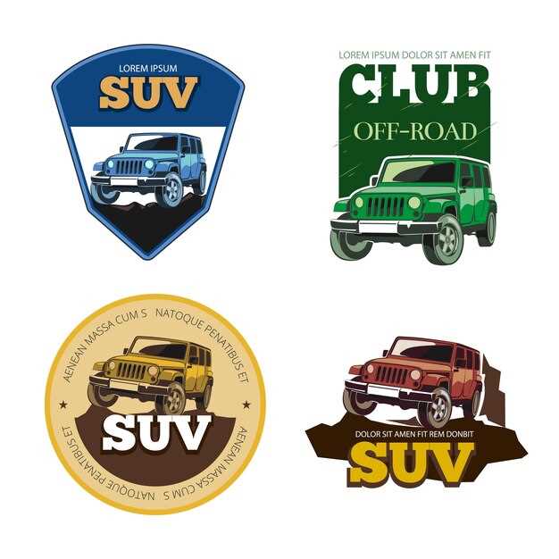
Throughout the 1980s and 1990s, the Jeep logo maintained its boldness but began to add a more modern touch, including subtle 3D effects and variations in color. The introduction of the iconic seven-slot grille element within the logo became a signature design feature, symbolizing the distinct identity of Jeep vehicles.
In recent years, the logo has evolved towards minimalism, with a simplified aesthetic that resonates with contemporary branding trends. The use of a clean, monochrome palette enhances visibility and adaptability across various platforms. Despite these changes, the core elements of the logo–its rugged style and a nod to its off-road roots–have remained consistent, ensuring that the Jeep brand continues to evoke a sense of adventure and reliability.
The Impact of Jeep Emblem Evolution on Brand Identity
The evolution of the Jeep emblem has played a crucial role in shaping the brand’s identity over the years. A distinctive and recognizable logo is essential for any automotive manufacturer, and Jeep’s design choices reflect its adventurous spirit and rugged heritage.
From its inception, the Jeep logo has undergone several transformations, each representing a shift in the brand’s focus and market positioning. Initially associated with military utility, the emblem has evolved to symbolize off-road capability and lifestyle, attracting a diverse audience of adventure-seekers.
The simplicity of the Jeep design has been a constant, but the variations in style and font have enhanced its appeal. The bold, block-like letters convey strength and durability, while the circular shape often evokes feelings of exploration and freedom. This evolution has allowed Jeep to remain relevant in a competitive market, effectively communicating its core values to consumers.
As Jeep has expanded its product line, incorporating modern SUVs and technology, the emblem has adapted to showcase its versatility. The consistent use of the Jeep logo across different models fosters brand loyalty, reassuring customers that they are choosing a product with a rich history of performance and reliability.
In the digital age, the visibility of the Jeep emblem on social media and advertising campaigns has further solidified its identity. The design has been leveraged to create a sense of community among owners, reinforcing the idea that driving a Jeep is not just about the vehicle itself, but also about the lifestyle it represents.
In summary, the evolution of the Jeep emblem is not merely a matter of aesthetics; it is a strategic reflection of the brand’s identity. The lasting impact of these design changes continues to resonate with consumers, ensuring that Jeep remains synonymous with adventure and exploration.